*Using Nature Journaling as a catalyst to create, how might we abstract the "Dawn Chorus"?
The Brief
Birding data is often cumbersome and hard to manage, as a design thesis project I wanted to explore different ways to show data that could fit a visual pattern. As an avid birder myself, I knew this would be a great jumping off point to form a new visual language for data enthusiasts.
Surveying some friends and family at the local estuary There were some outlines to be followed
A way to capture data across multiple senses
Writing and reading data as fun or helpful
A way to track where and when these events happened
Bonus: Looks cool when out and about
Designing a Visual Language
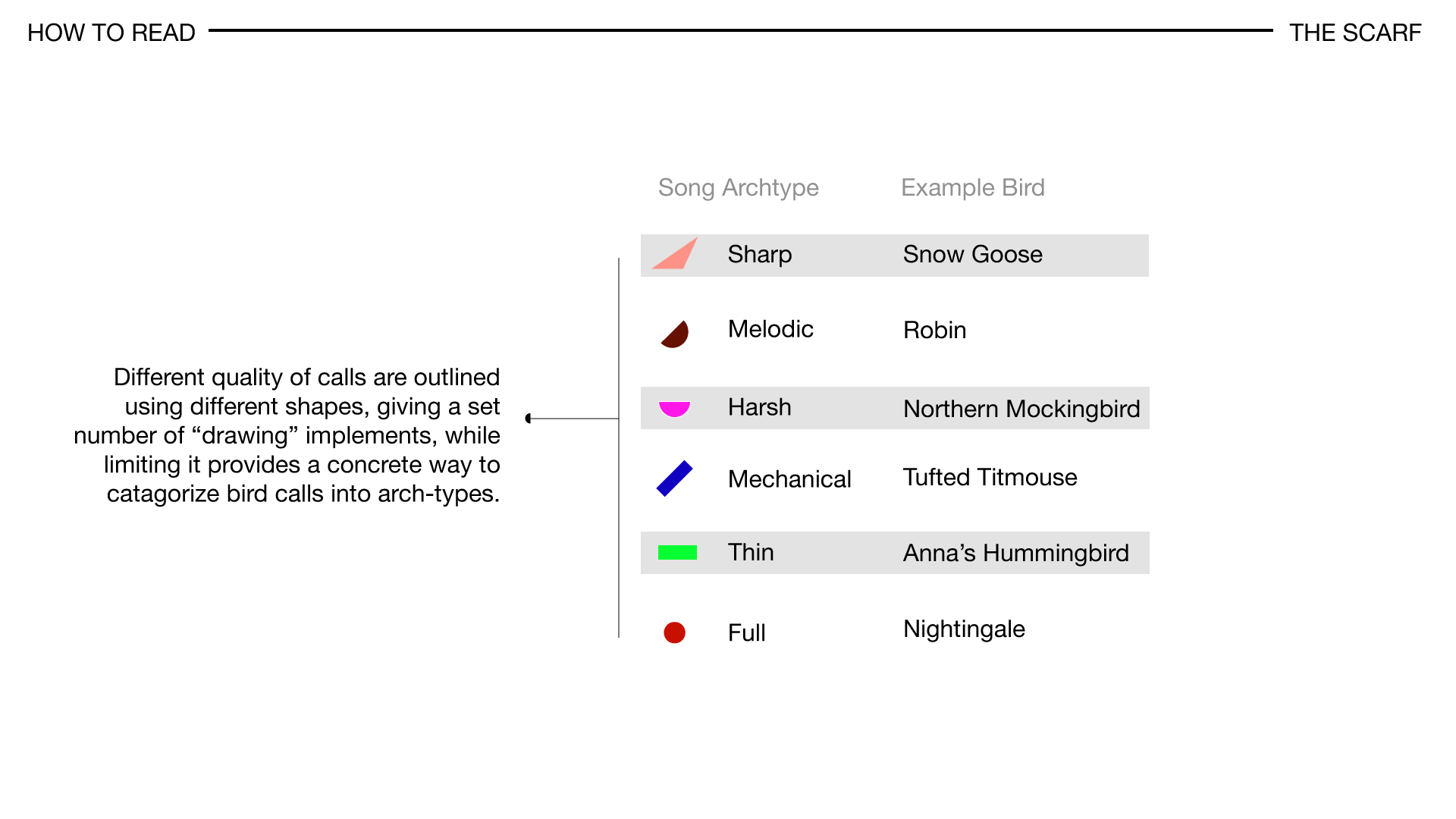
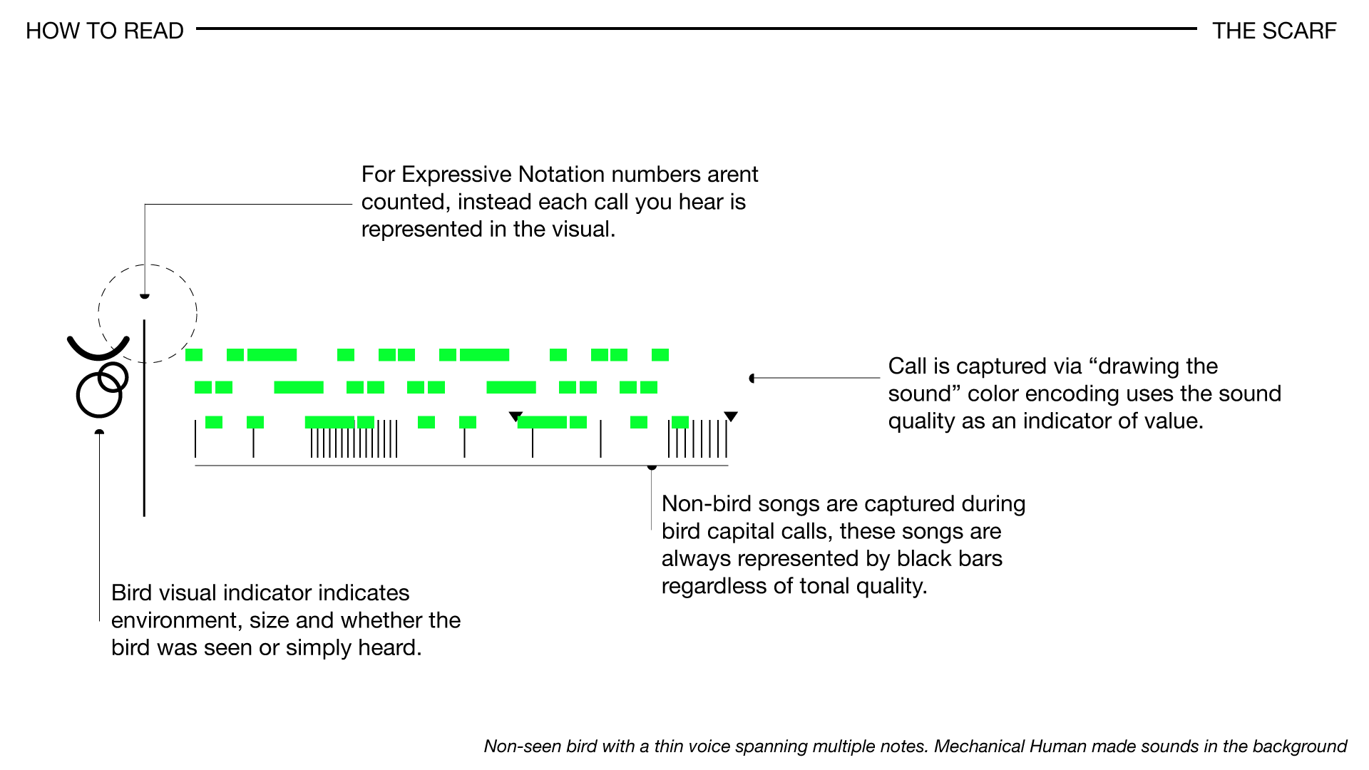
I extrapolated a visual language based on call frequency, call length, and loudness based on location. Drawing from my musical background it was easy to see how we could add musical symbols to the "score".
Below you can see John Muirs Laws illustrating this principal he developed for sketching bird sounds:
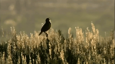
The Problem with Sound...
Bird Song as a medium is difficult to abstract because of its variance in sound texture and call length. In order to present a consistent aesthetic I used this paper from Harvard as a metric to help reel in expectations of what an abstracted sound could look like. By diffrientiating bird song by length and by type (and by including a way to catagorize some birds as "unknown") this helped me create and define a color + texture pallette.
Reframed Problem
*How would we make recording data attractive for new creatives and citizen scientists?
By reframing the question as a UX problem Dawnchorus can position itself as less of an object and more as a language. Therefore giving people agency to create their own data-landscapes.
Solution
I think that as this series data collection expands there is an opportunity for a more diverse set of display patterns based on different areas around the world.
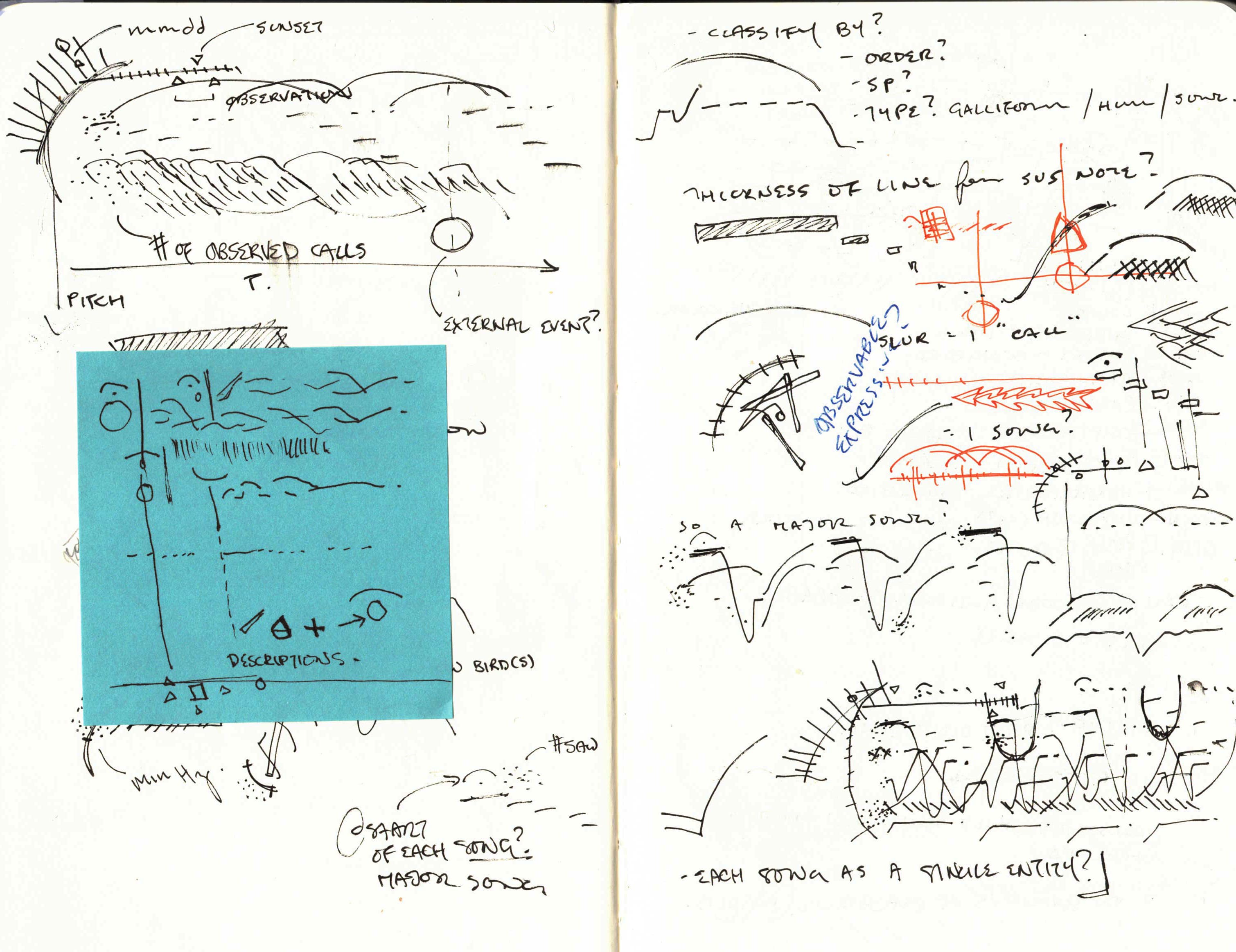
"Form following function" was the result of multiple iterations and studies of placement and scale. More specifically I wanted to look at how displaying the data aesthetically could lead to a better product.The hardest part here was finding a visual that showed cohesion and was bold enough to stand on its own. As I began to diverge from the initial idea of data formation, I explored other ideas that drew on pattern, repetition and more subtle encoding.
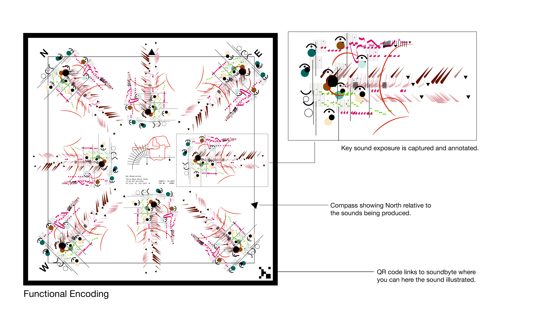
The different functional forms arose when realizing there isn't quite a one size fits all for sound illustration. The more complex the sound profile the harder it is to read. I figured a happy medium was a double encoding, one that highlighted simplicity and another that valued the full expression of sound.
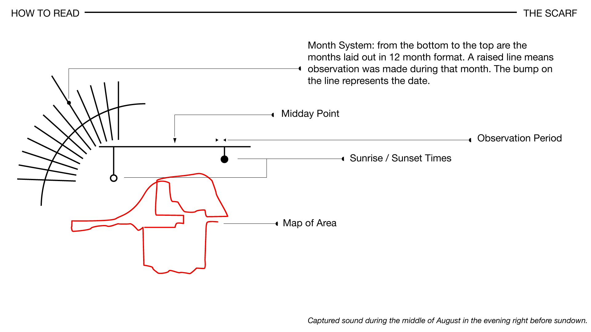
The map time and date was inspired by sundial clocks after a visit to a garden during the summer. Abstracting the dates and times of sunset and sunrise was a fun excersice in open wondering, and modifying for visual clarity after testing with friends.
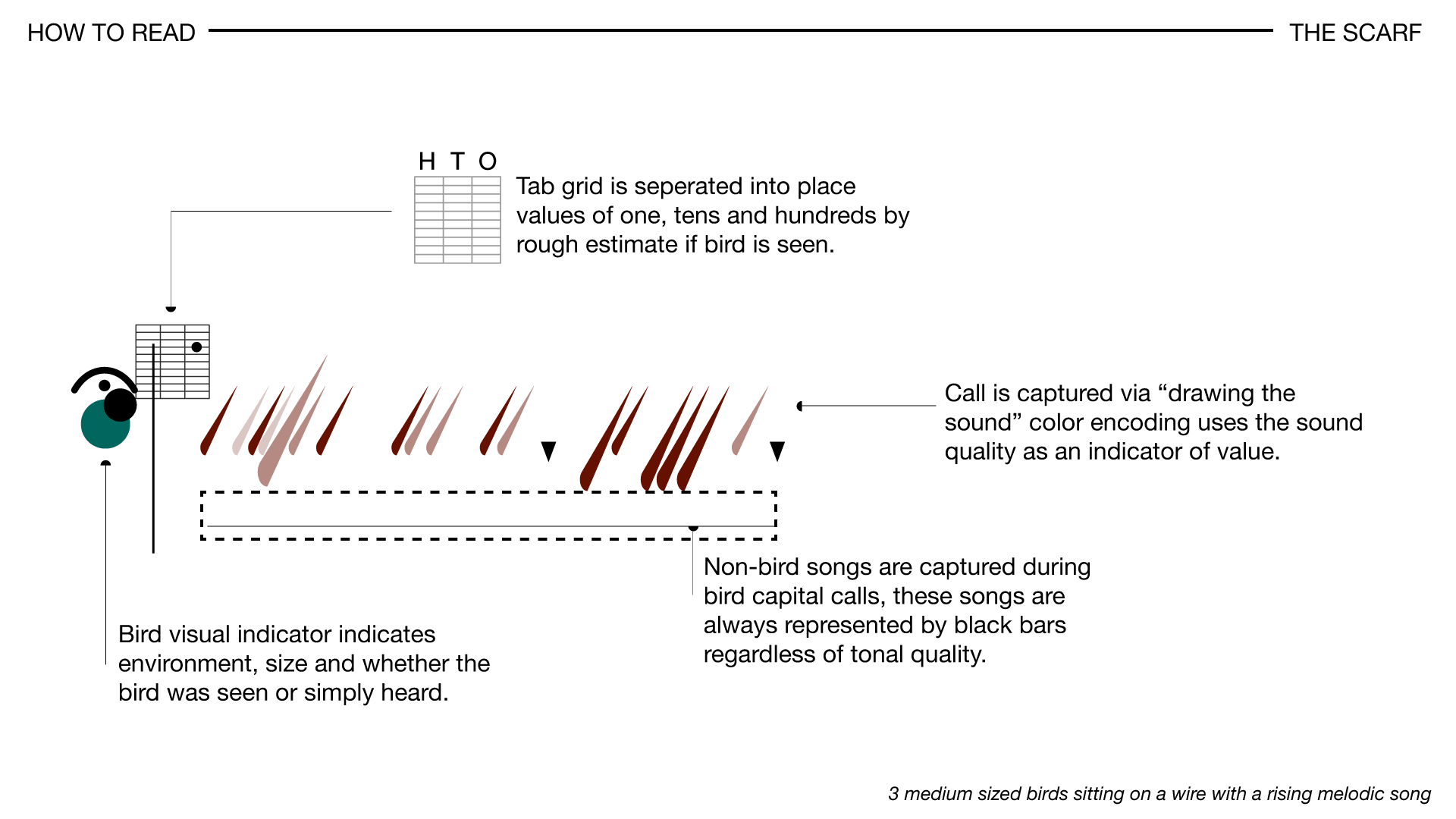
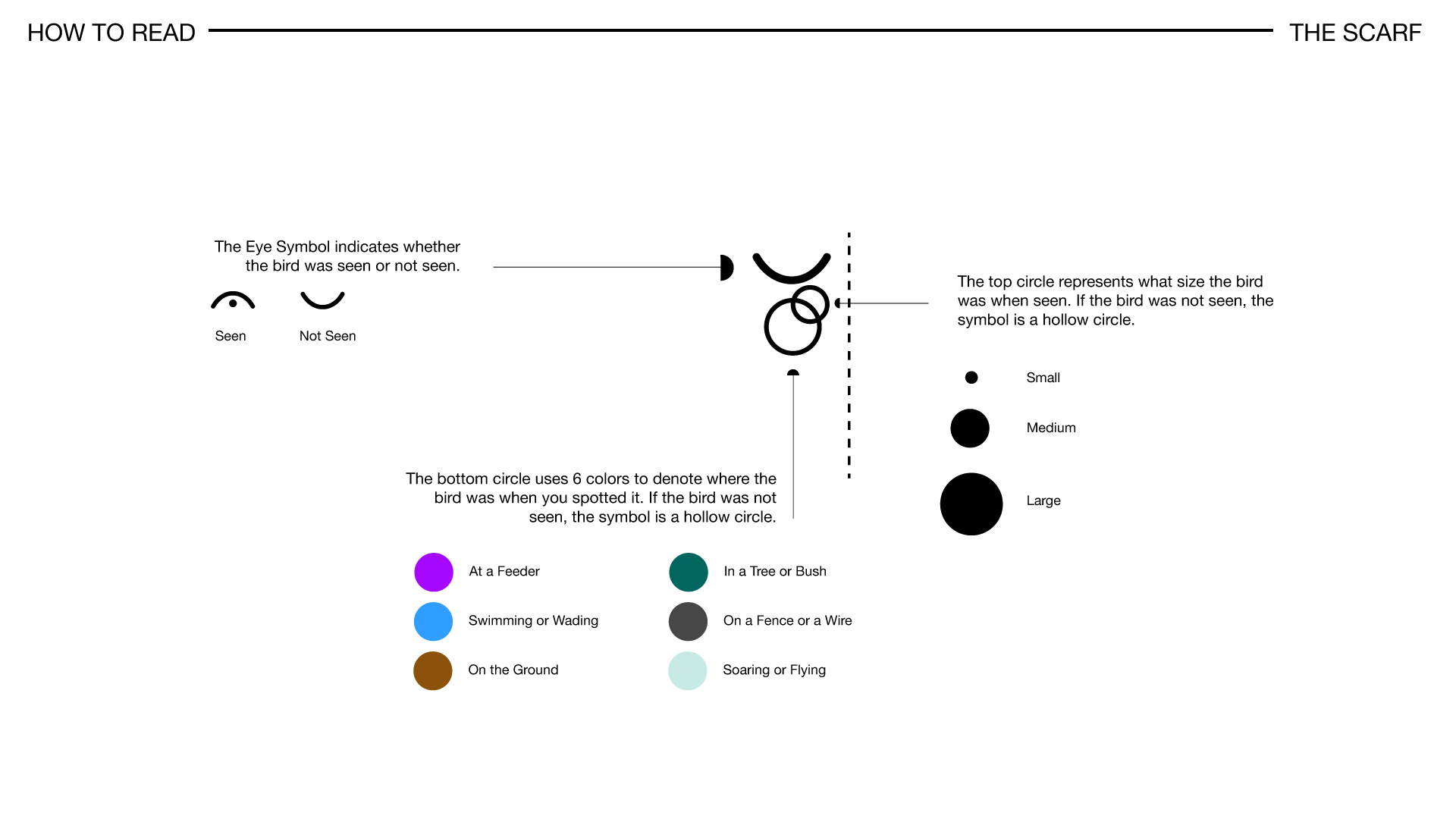
The system to the left of the eye icon illustrates the number of birds as a visual barometer using rough estimates and dot system notation. To minimize information overhead and to make the interaction cheifly about the picture it paints we've omitted bird type from the indicators, instead the dot system takes care of where "geographically speaking" the bird was seen.
Visual Impact
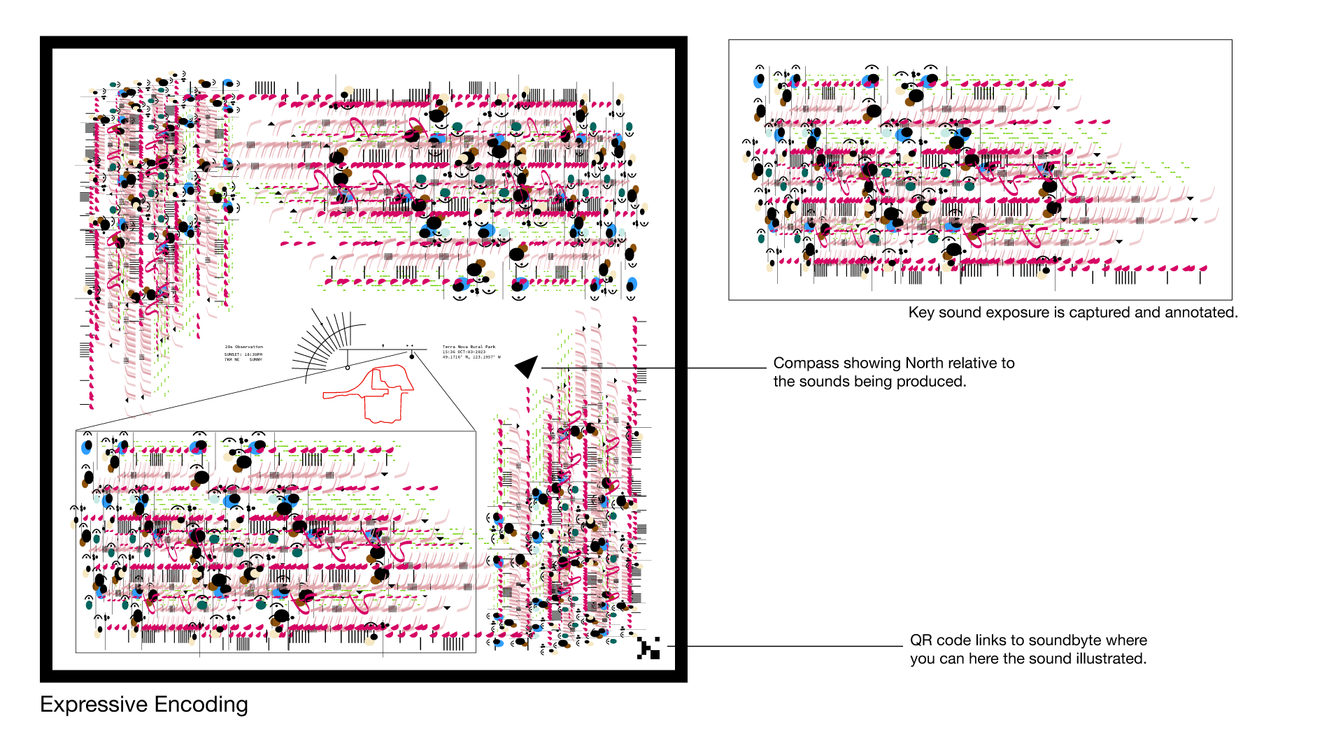
By creating a way to illustrate time and direction as well as "intrusive songs" the goal was to create a sensory experience relative to timescale, allowing each observation to have its own "voice" musically. Creating a way to identify sounds visually first by creating iconographs that correspond to the 3 taxa I've mapped sound into, this taxa was later simplified by shape instead of iconographs making the reading and translation process easier.
The final product looked at each call as an individual bird signature, repeating a "capital call" for a distinct bird. Using scale and a grid system to drive the interaction. As the bird signature is "called" the song is logged in a column. Intrusive songs (Songs that are man made) are logged as well and compressed into the column.
Catagorizing and displaying the sound patterns was a challenge in both visuals and data readability as the more wild and experimental the data captured, the harder it was to read. As I started looking into display patterns, radial patterns provided the perfect counterpoint to the scarfs linear design. All you need to do is listen and wonder.∎
.png)
_ex.png)