Project Overview
Through written user tests and a comprehensive process analysis, we implemented targeted improvements to the platform's visual design and user widgets. These changes helped scientists access their data more quickly and clearly. Internal testing showed a 9.46-second reduction in overall task time, enhancing user clarity and contributing to platform growth.
Designing for the User
Researchers weren't spending enough time on research, leaving problems like biological status and population numbers either crucially under-researched or under-represented in report finding. Oftentimes, end users needed to access multiple reports and access points to track metrics across various pacific salmonid populations, finding themselves stranded in a sea of data.
Critical Question
*How can we design a better user experience for goverments to make informed choices on projects that could impact future salmon stocks?
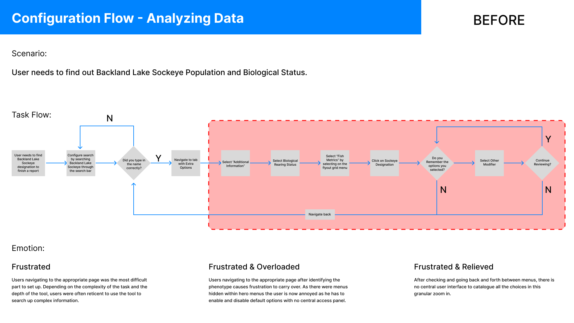
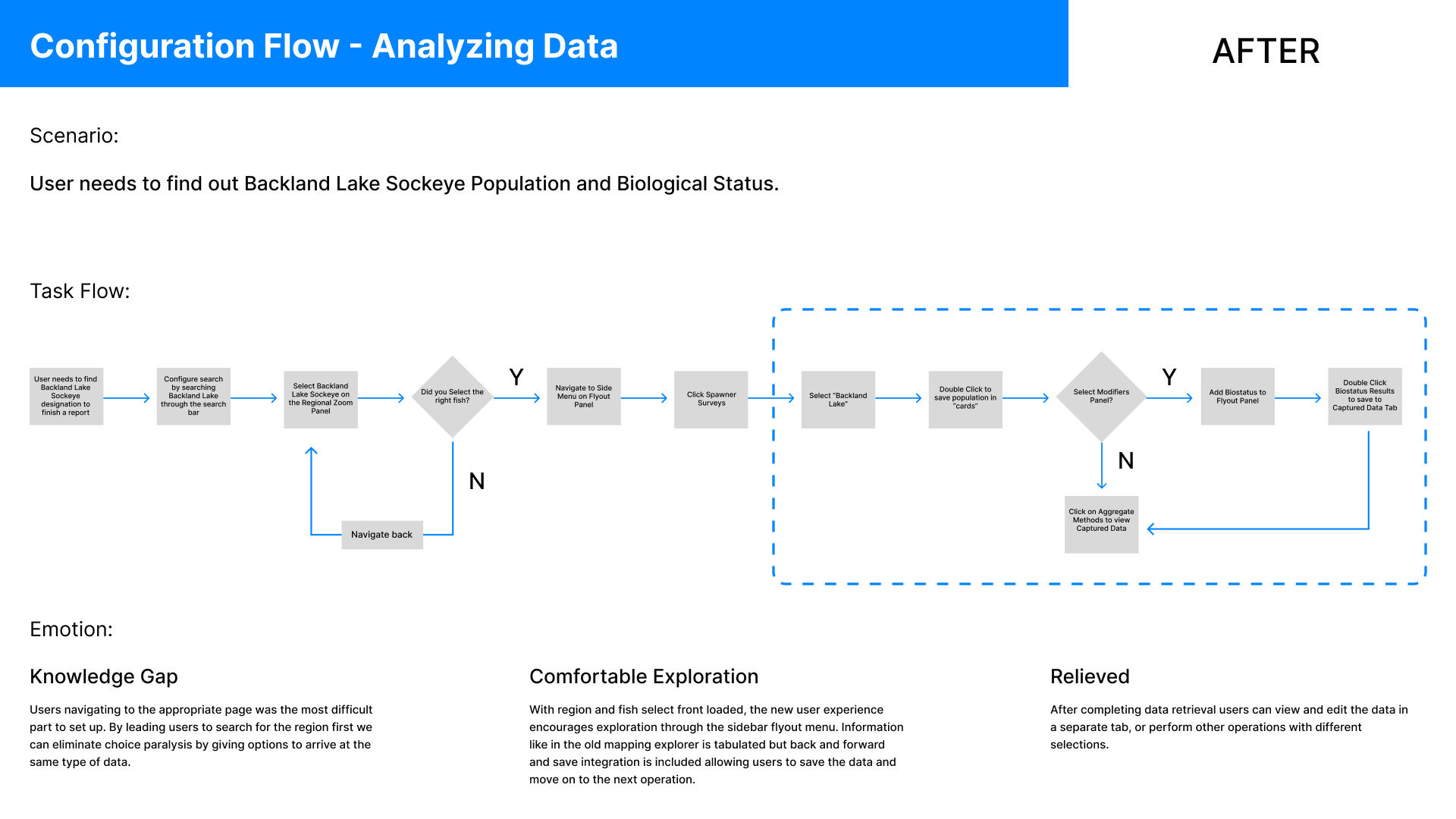
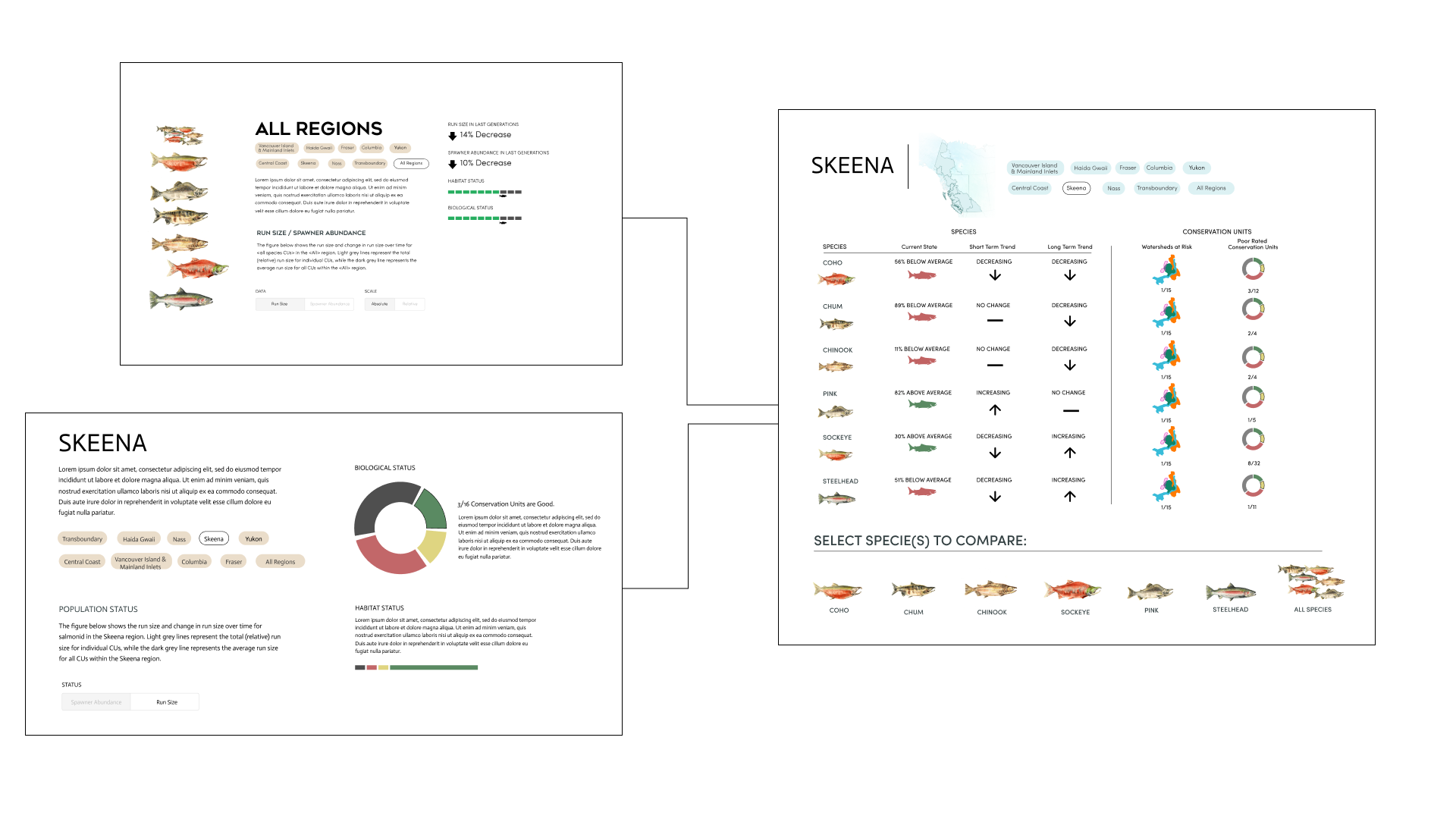
Above is a structured before and after of the user flow. By reducing the overhead in the option select, we can allow for a greater range of expression in how the data is structured visually.
Process
My proposed user experience intervention involved redesigning the information layout through a parallel feature: the horizontal omni menu. This menu allowed users to search all phenotype-related queries simultaneously. By providing access to comprehensive information after filtering, users were better centered in their workflow. Additionally, the ability to save data to a separate tab created a quick and efficient way to catalog and organize information—eliminating the need to repeatedly navigate the retrieval process.
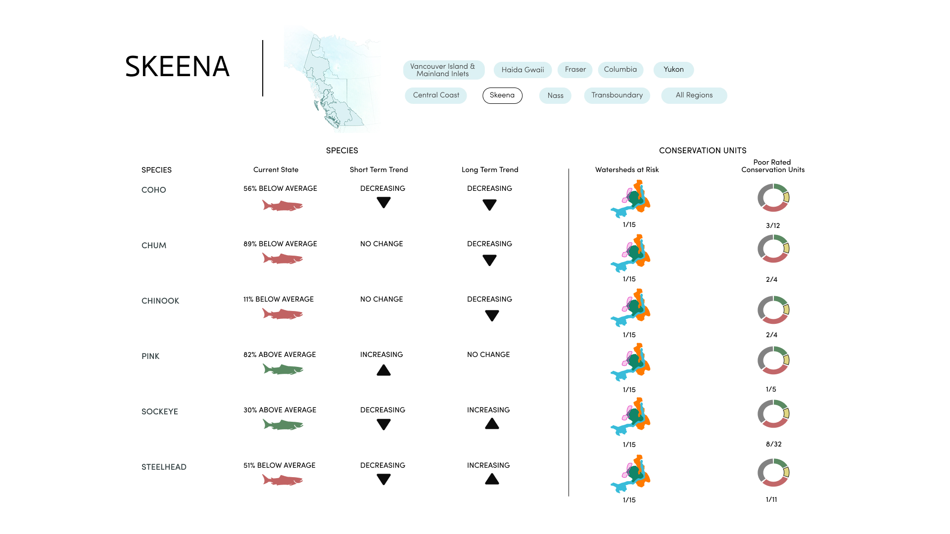
Internal testing revealed that users were less likely to read the front loaded information, so after some deliberation we simplified and focused data to be more visual. We replaced the introduction text with a card system that highlighted "glance-ability" so users could see immediately the impact across the region on all salmonid species.
In our final iteration we looked at a funnel system that helped center the user. We wanted to give a scope in and out interaction that allowed users to look at status then assess salmon needs through a triage system. We built this system directly into the overviews to give a stronger presence to this extension of the PSE experience that also lays a narrative thread to an experiential status site called State of Salmon .
Reframed Question
*How can we influence readers to think about data in two-dimensions?
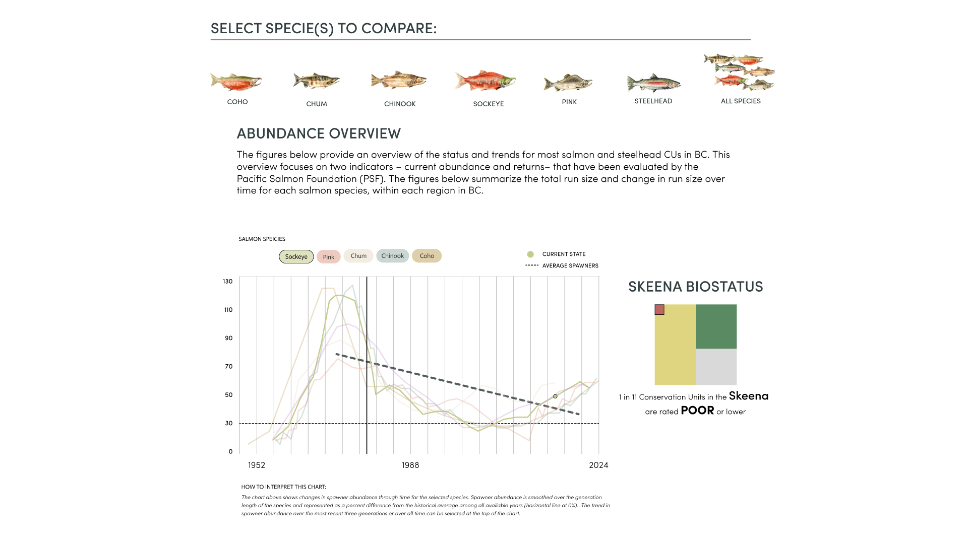
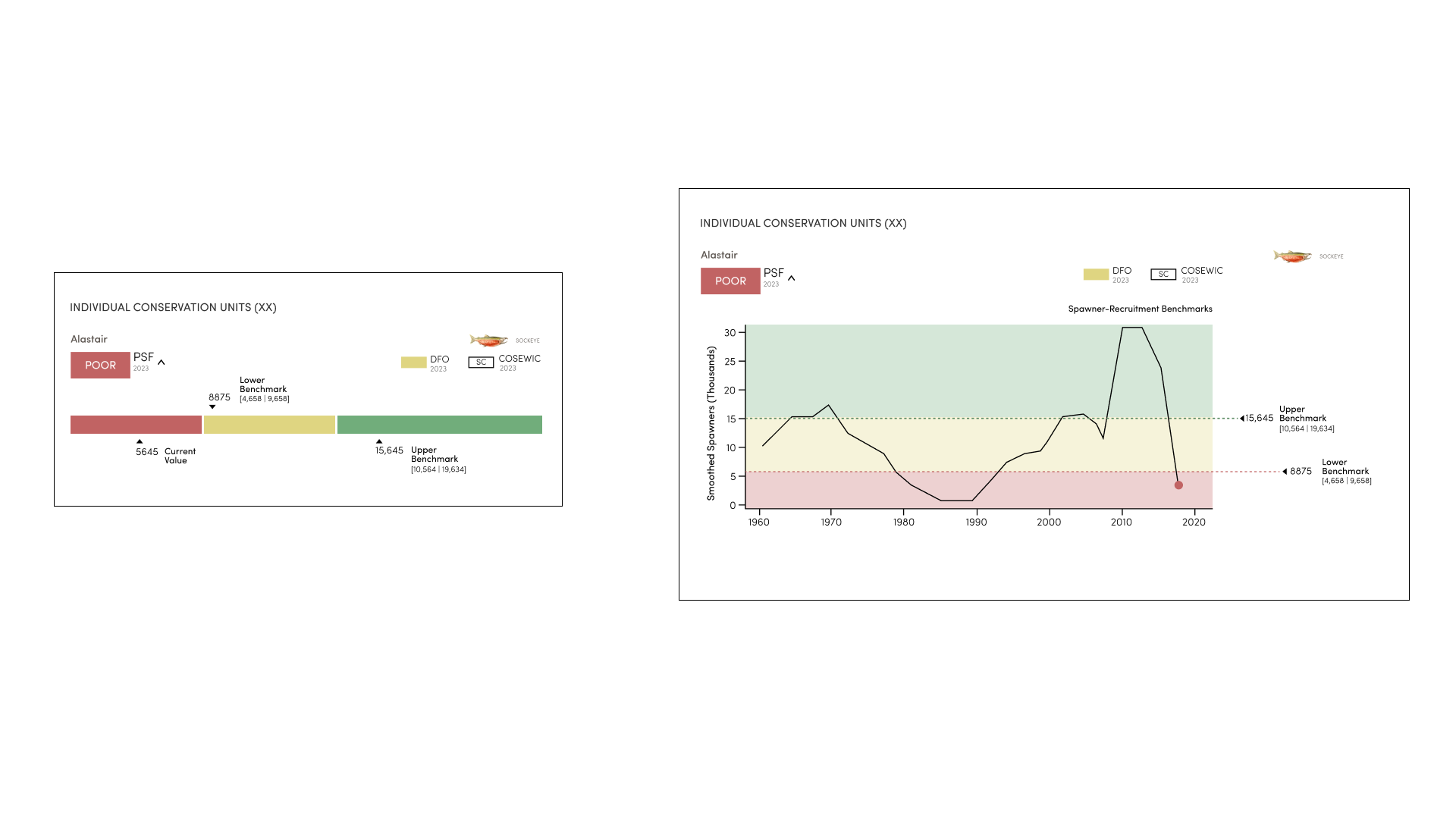
Biostatus provides salmon biologists with a quick overview of ecosystem health without needing to review all detailed data. It helps researchers plan their work efficiently without getting overwhelmed by extensive reports.
Initially, we used a bar chart combined with a trimetric badge (tribadge) to improve communication between different classification systems. However, user testing showed that the bar chart didn’t provide enough detailed information on individual pressures, leading us to explore more detailed ways to present the data.
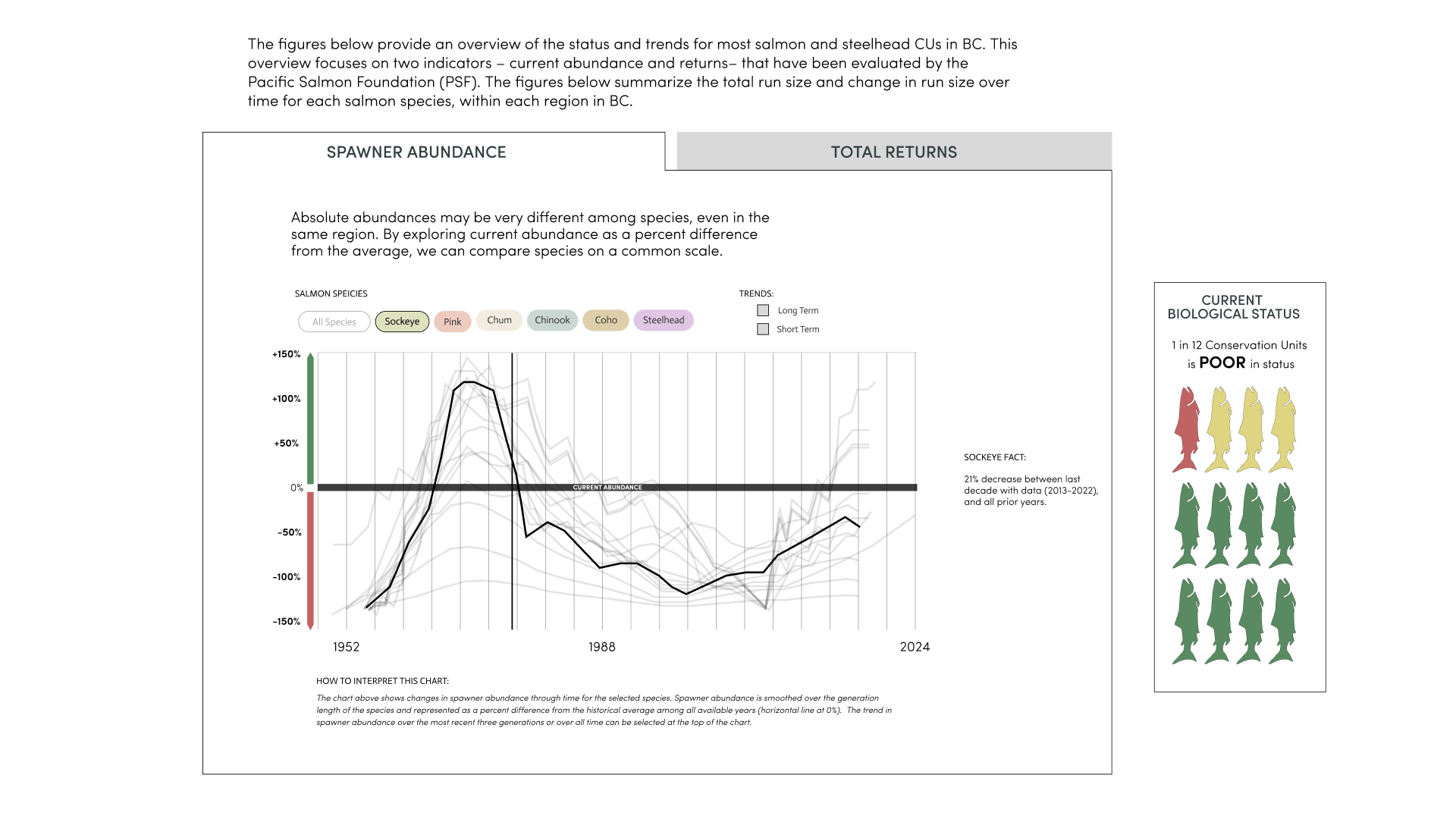
In this redesign, data is organized and displayed using confidence intervals on a 2D plot, prioritizing the accuracy of counted spawning salmon. The confidence intervals allow users to explore the data more deeply by positioning information spatially within the graph. This spatial reasoning also allows us to visually assess rates via the line graph instead of being just abstract numbers over time.
By consolidating the data into a more visual format, we addressed issues of granularity and focus, enabling researchers to track changes over time more effectively.
Cartographic Design
During my time contributing to a salmon migration mapping application, I focused on how color and icon choices affect how easily users can read and navigate the map. The existing color system had been built up piece by piece, with each layer designed independently from the others. Through a heuristic evaluation, I found that the salmon run icons were visually competing with the basemap beneath them rather than sitting cleanly on top, which meant users had to work harder just to orient themselves before they could engage with the data. Many stacked icons created a clumping effect that made each place when zoomed out visually hard to read.
To solve this I implemented a white border to each icon set in a 36x36 grid as well as a visual culling system so that when zoomed out icons would not overwhelm the map.
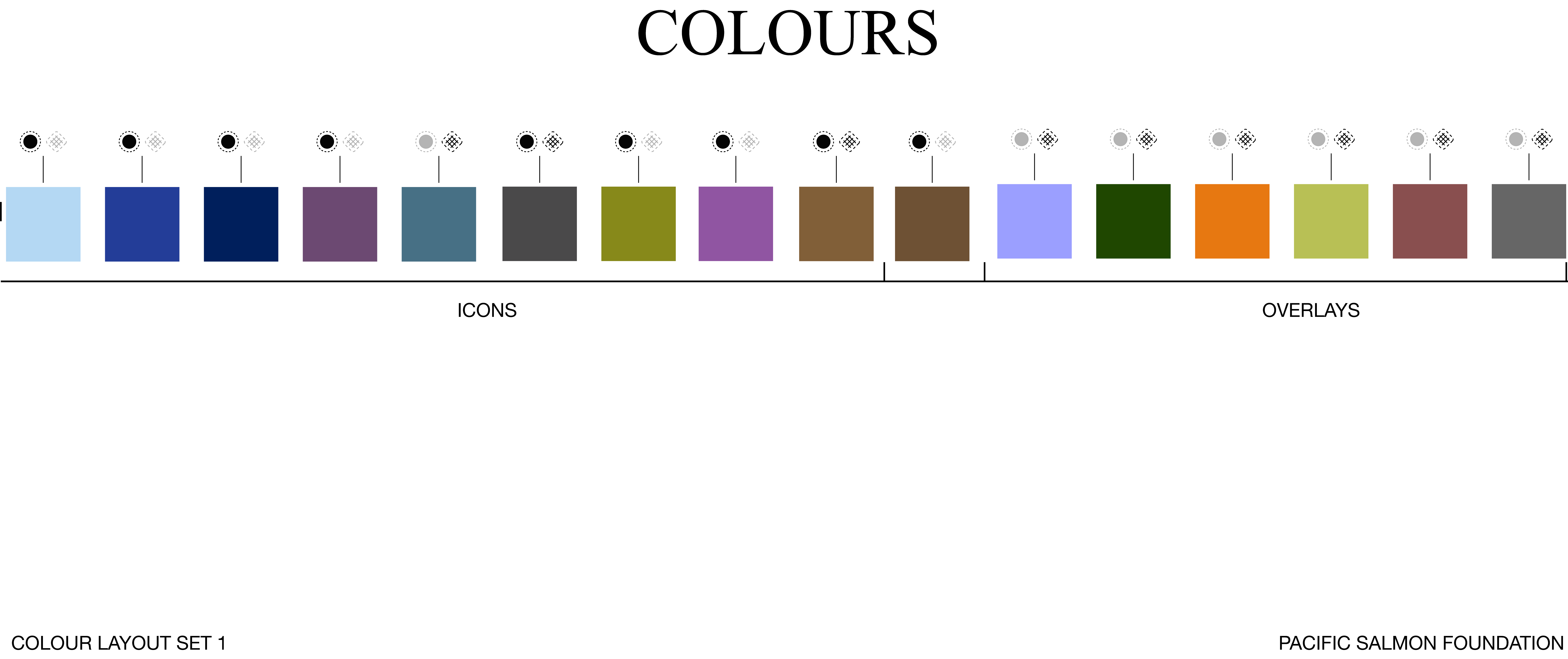
Overlays
Overlays of colours also presented a significant accessibility problem, as different populations merged together a "water color" effect occured where layers became increasingly difficult to distinguish for users even with perfect colour vision. The core problem was contrast: multiple colors even across the entire chroma pallete caused specific conservation units to be obscured.
To address the visual stacking problem, we paired hue groupings with pattern overlays so that each data layer maintained a distinct visual identity even when multiple layers shared the same visual space. With that separation in place, we used chroma to carry the environmental hazard data, reserving high-chroma values for active conditions and lower-chroma treatments for background context. The result was a system where every layer remained legible both in isolation and in combination.