Selected Cards
These are some of the selected cards (and errata) I've designed over the past 3 years. There is a story for each one, and many many hours trying to ideate a new way to integrate a paper mechanism.
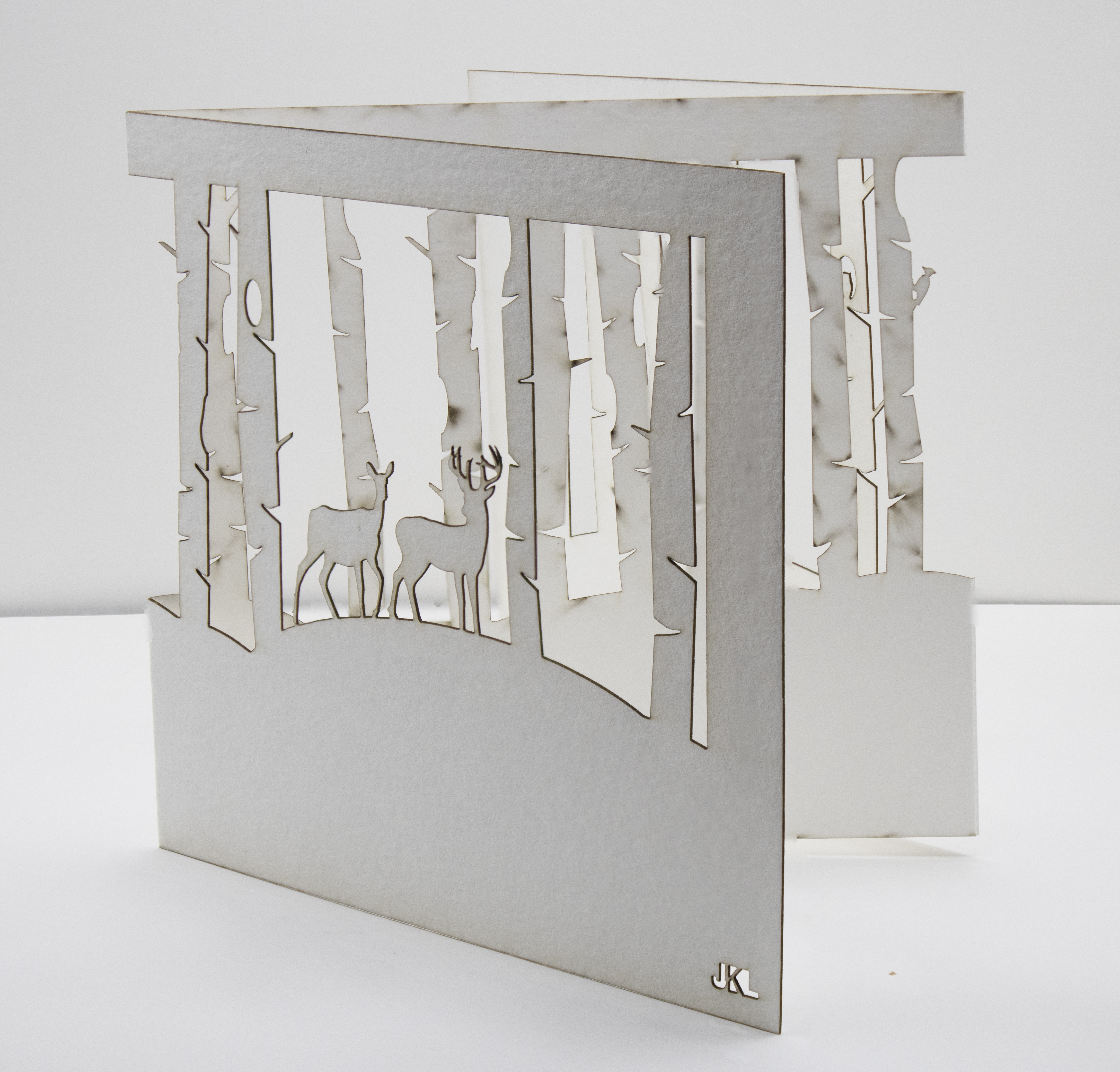
Forest Walk
- Mechanism:Fold
Initially I wanted this card to be free standing but, I realized later on that I needed something to hold the frame together. The idea was a snowy walk in the forest surrounded by woodland creatures.
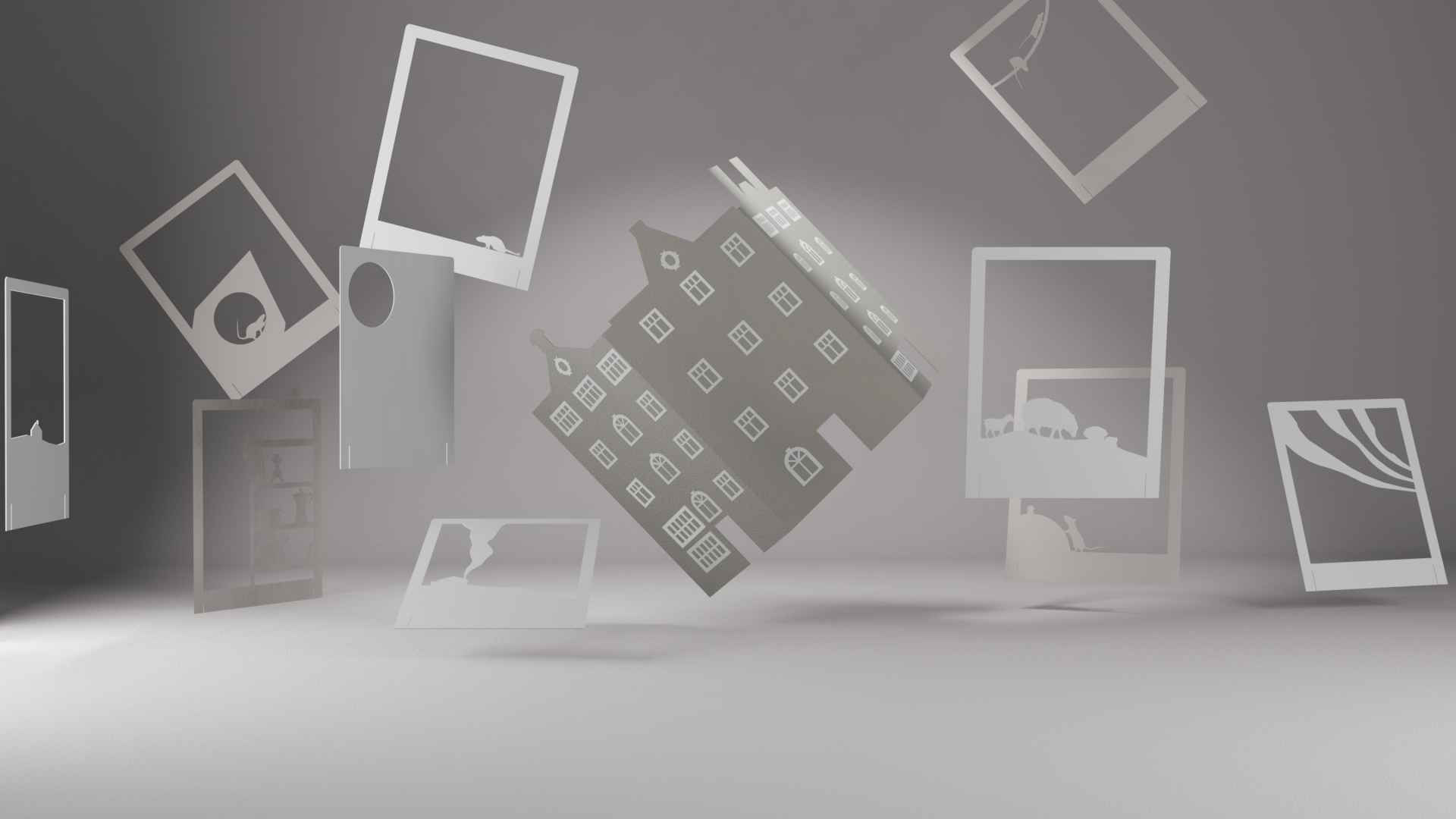
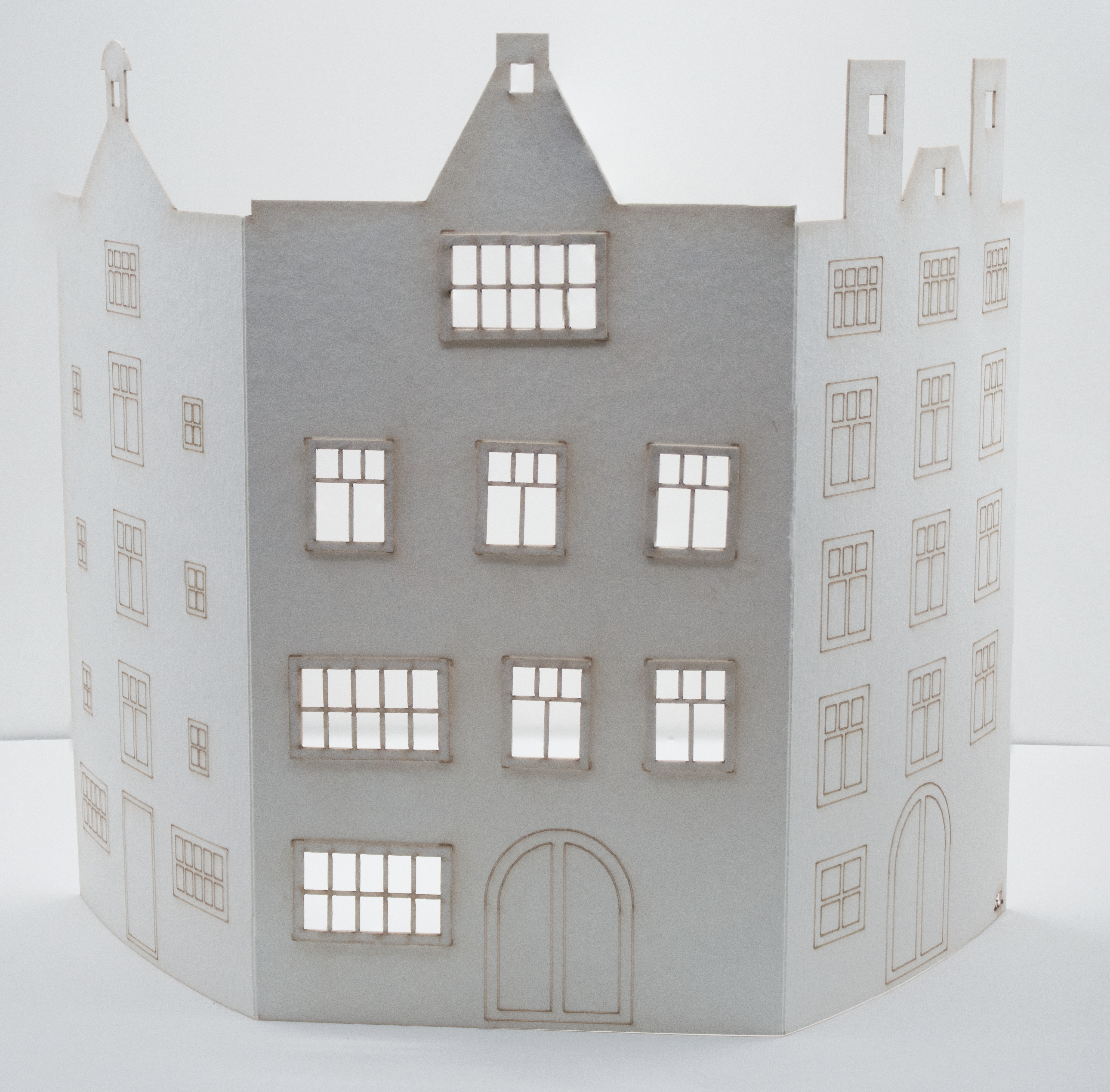
CanalHuis
- Mechanism: Fold
Inspired by Emi Hazlett I designed these houses to be combined together as a row of canal houses from Amsterdam. I designed the cards to be scored and folded by hand.
Redesigned these in 2025 to function as both greeting/ christmas and thank-you cards, I created a new stand alone piece that uses more detailing to paint a more vivid picture of the houses I saw in Amsterdam all thoes years ago...
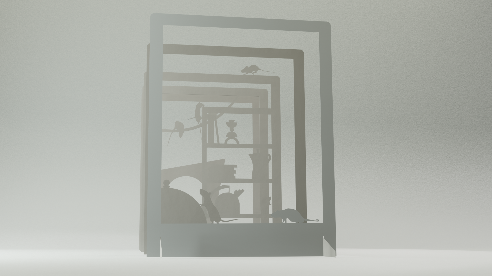
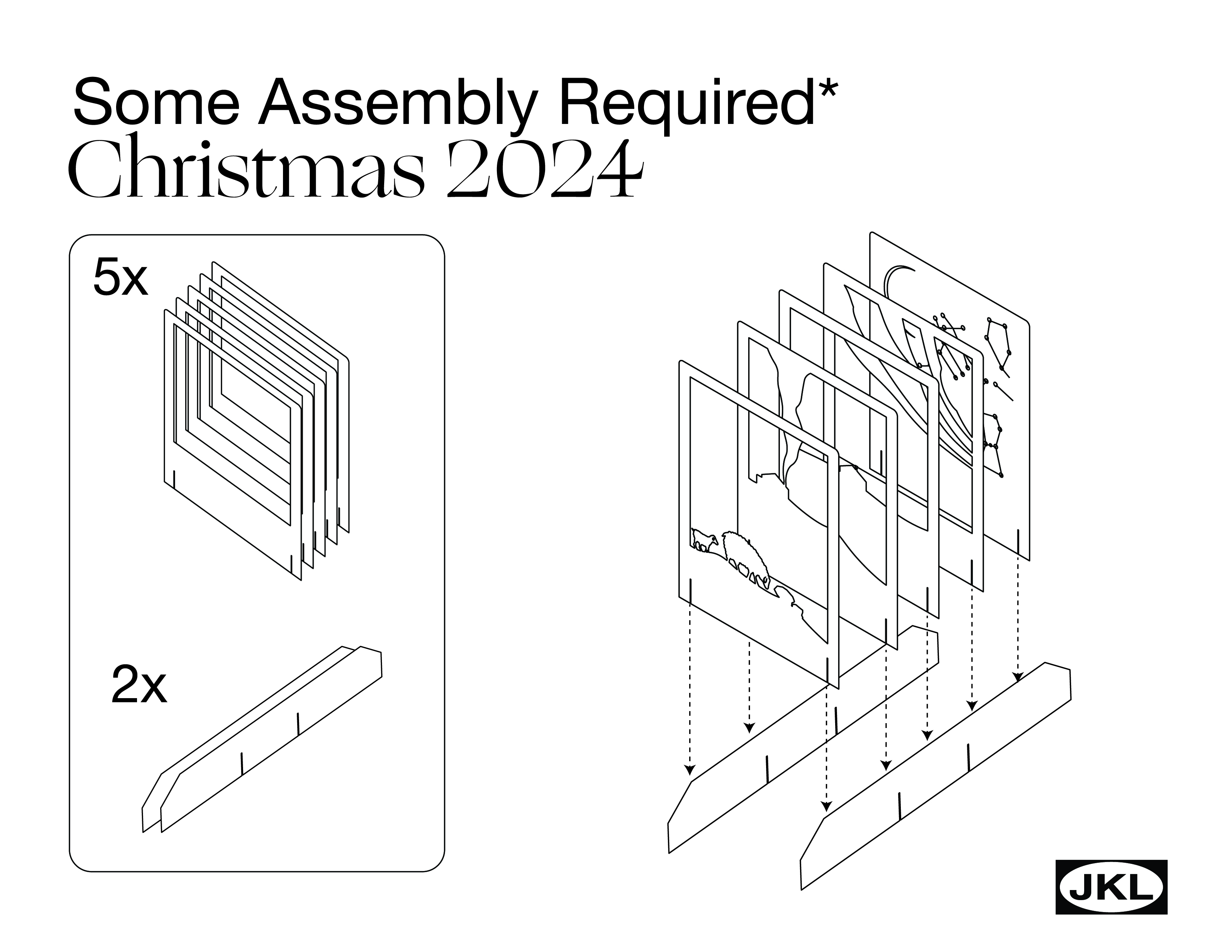
Quiet as A Mouse
- Mechanism: Shadow Box
Learning how to design a free standing shadowbox was a bit of a challenge. Paper kerfing was measured with calipers before designing the stands. I used the old bellows style cameras as inspiration for the card sub-units. In the end, I ended up gluing together the pieces for a more cohesive final look.
I created an addedum that took the form of a manual to detail assembly, with the intention that the card was to be shipped in pieces and to be assembled by the recipient. I ended up not needing it, but it was a fun way to communicate intent ( and who doesnt love IKEA?!).
Albers Ornament
- Mechanism: Turn
Researching the affordances and architectural properties of paper lead me to the one of the earliest forms of a Bauhaus excersice imposed by Josef Albers in the 1920's.
Using a piece of paper create a dynamic form that shows the affordances of paper.
Inspired by this notion and the 2018 snohetta star design I wanted to create an ornament that looks like a swirling orb in flight. By taking a circle and making concentric cuts I was able to make the paper curve in 3 dimensions. This created an illusion of an orb swirling in midair.

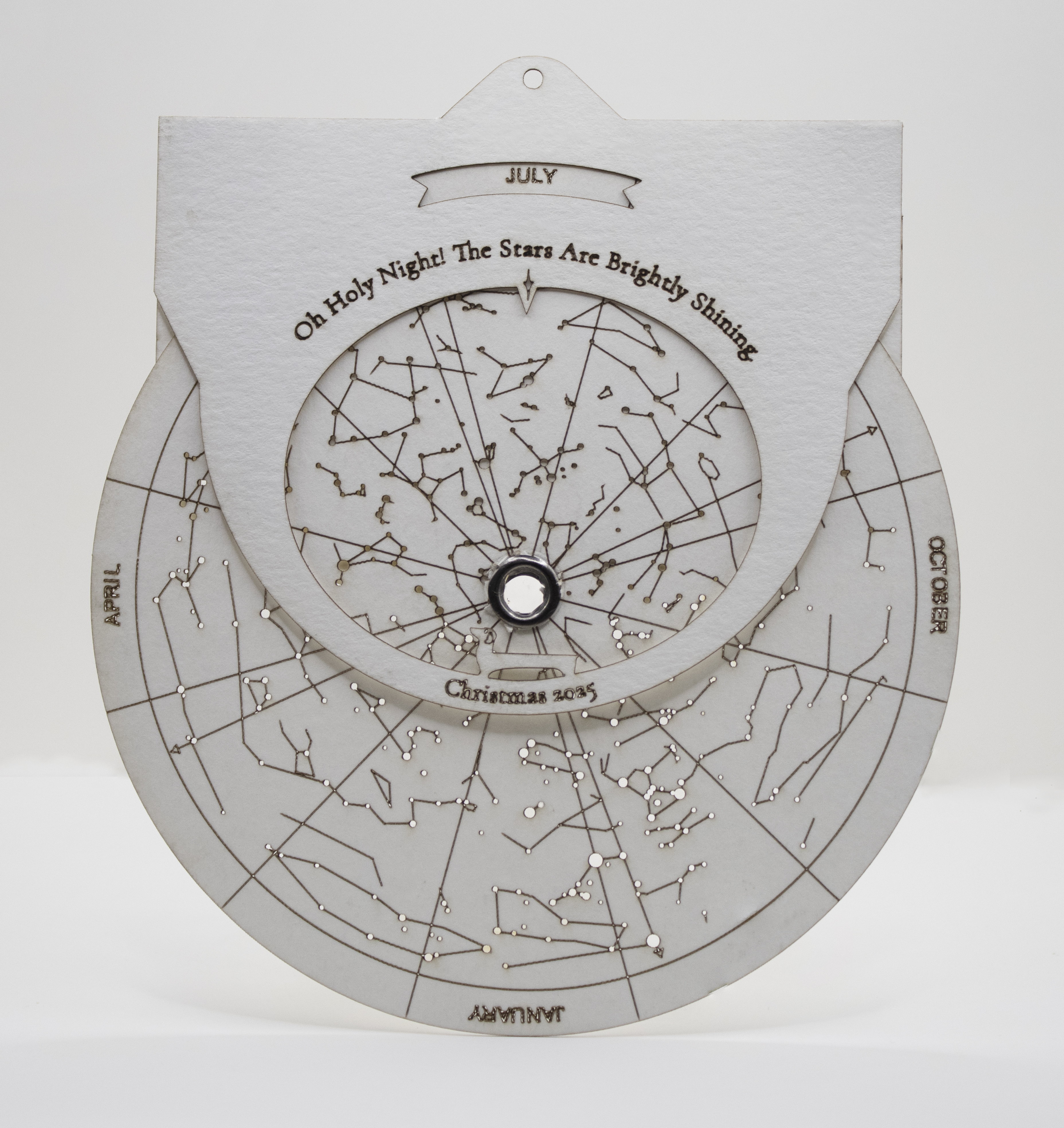
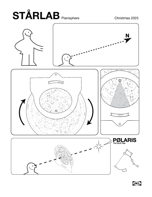
Starlab
- Context: Christmas 2025
- Mechanism: Turn
Doing research I chanced upon Star-Maps and Astrolabes from the near-east. After a couple weeks of ideation and sketching and some very rough paper prototypes I came up with the idea of a simple star chart that used a simplified grommet mechanism to turn. Viewable from the front the star chart was made in 2 variations (Vancouver and Toronto) to cater to all my friends living in different places.
As many people (myself included) haven't used a star chart in eons, I made an ikea style graphic to help refresh our memories. All you needed to know was which star was Polaris (Which again I definitely knew before hand...).